

Case study · Branding
Amity Barn
A hand-drawn brand identity for a local barn and residential home.
The brief
Studio Roo created the brand identity for a local barn and residential home. The mark is drawn by hand, an etched barn and tree over custom script lettering, shown here in print, pressed into kraft paper, and painted on the barn siding itself.
The identity
One mark, many surfaces
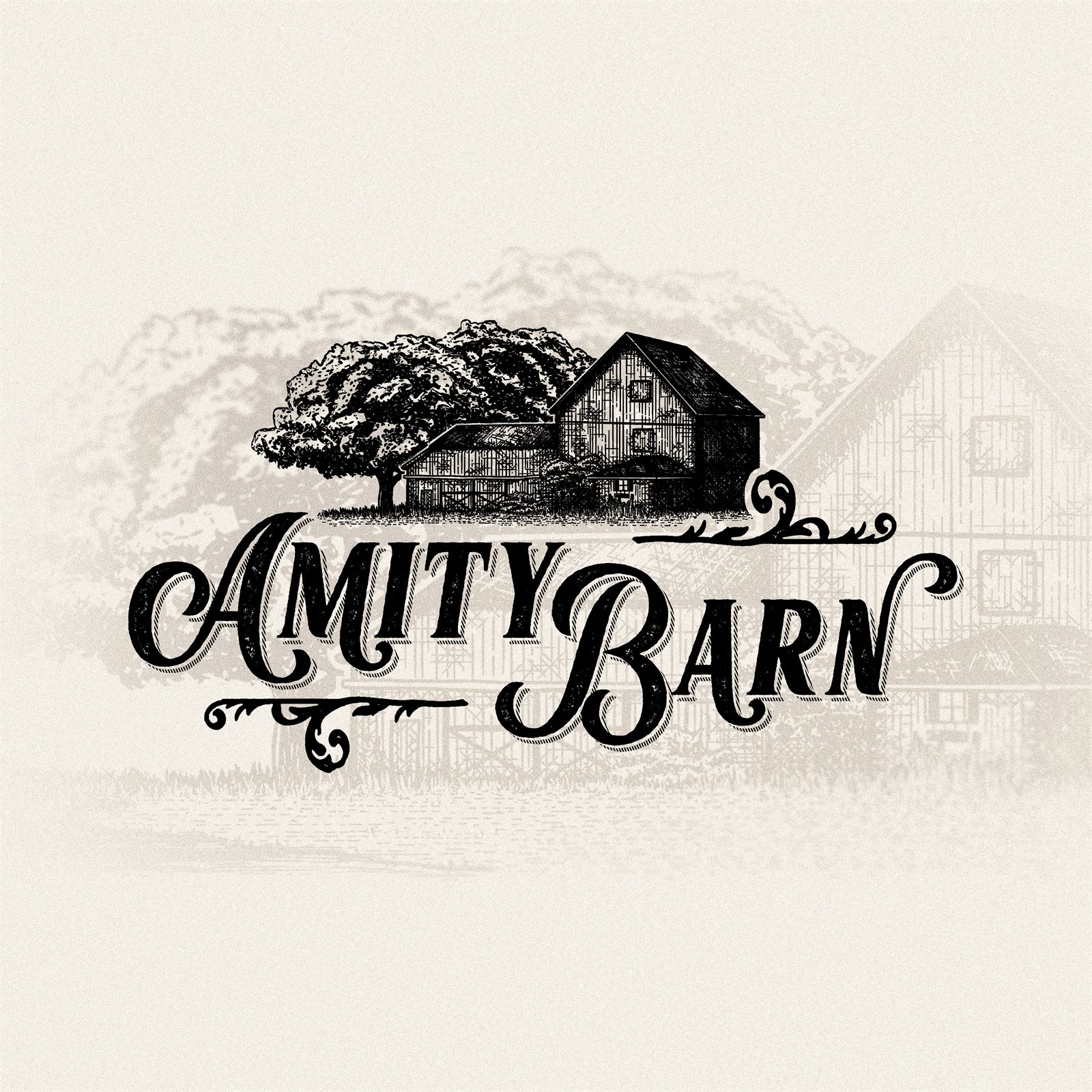
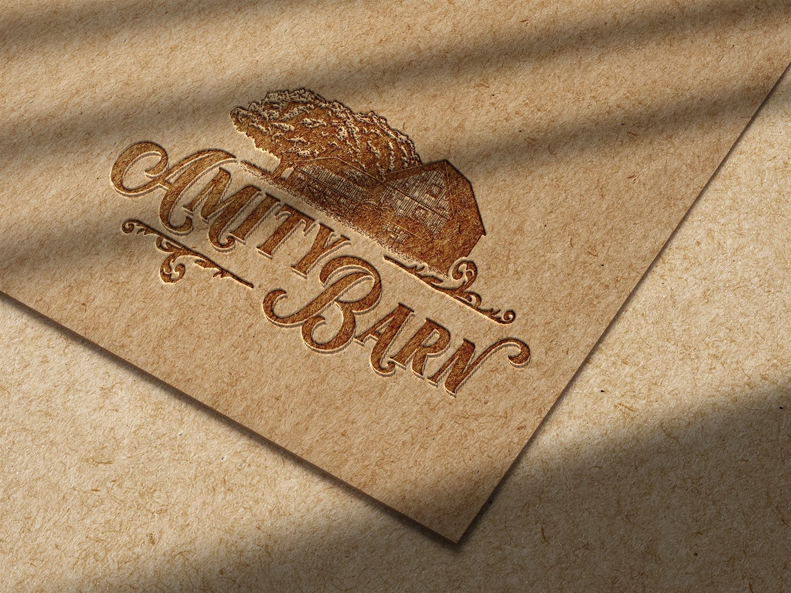
The kind of mark that looks like it has been on the barn for a hundred years.Amity Barn brand identity, drawn by hand
Got a brand like this one?