Case study · Branding
Harrigan Media Group
A founder-led rebrand that carried recognition forward and gave it new meaning.
The brief. Harrigan Creative had grown beyond the name and identity it began with. The brand needed to communicate a broader capability while preserving the personal accountability and direct involvement from founder, Henry Harrigan, that distinguished the company.
Studio Roo was brought in to clarify the company’s positioning, explore a name capable of supporting its future, and create a complete identity system. The goal was to help the business feel established, capable, and approachable without presenting it as a large, impersonal agency.
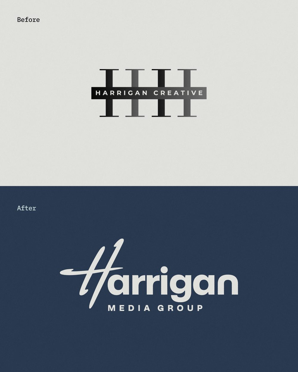
The opportunity. The existing identity held valuable recognition in the Harrigan name and its mirrored “HH” monogram. Rather than discard that equity, we saw an opportunity to understand what was worth carrying forward and give it greater purpose. We began with a client questionnaire, collaborative mind-mapping session, and strategic foundation: positioning, mission, target audience, brand personality, and voice. Naming exploration grew from this foundation. We developed distinct naming territories and considered more than 300 candidates before using a shared ranking system to compare, shortlist, and refine the strongest options.
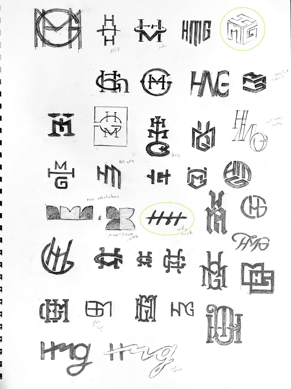
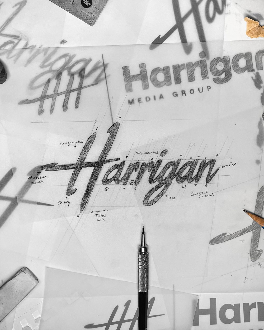
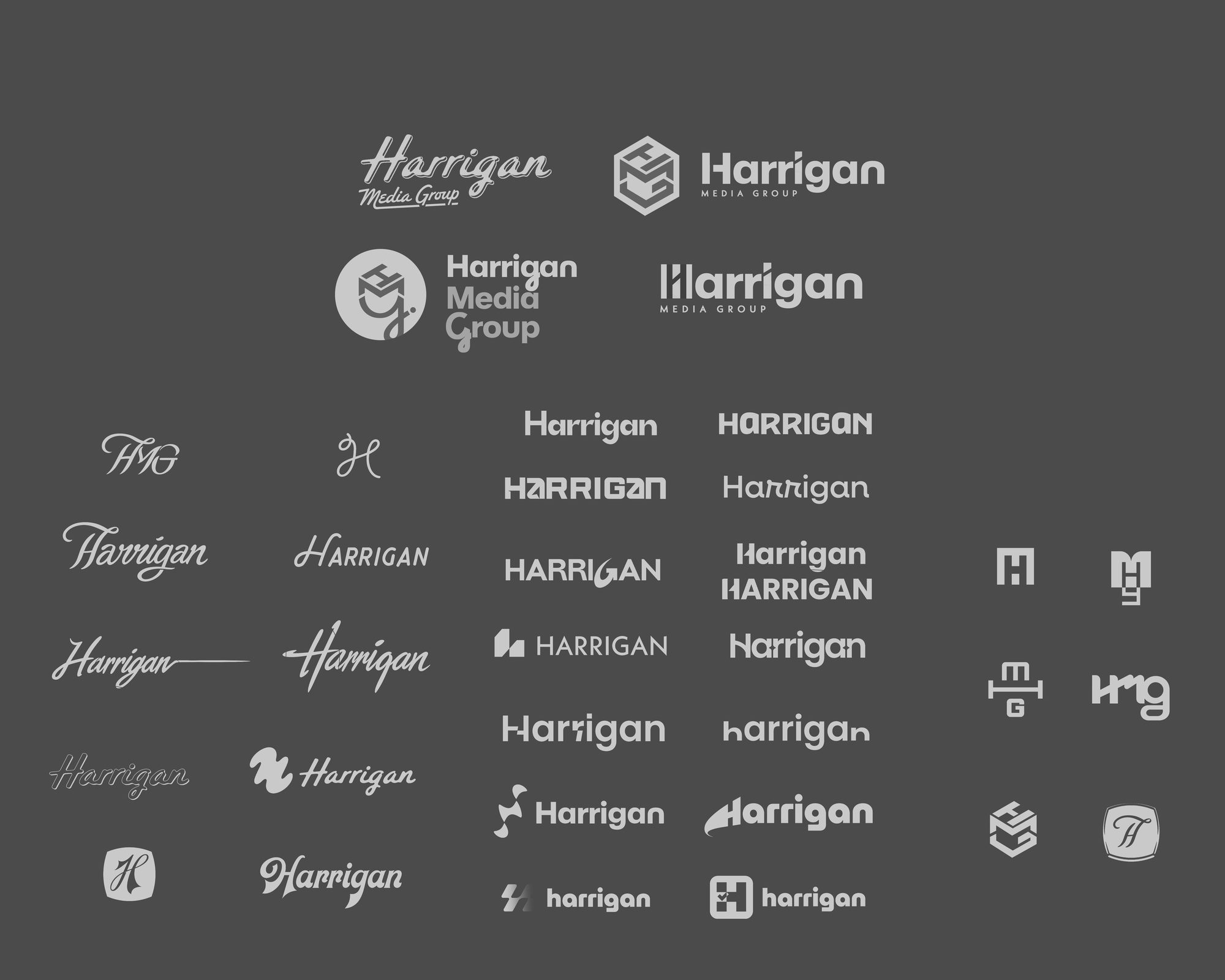
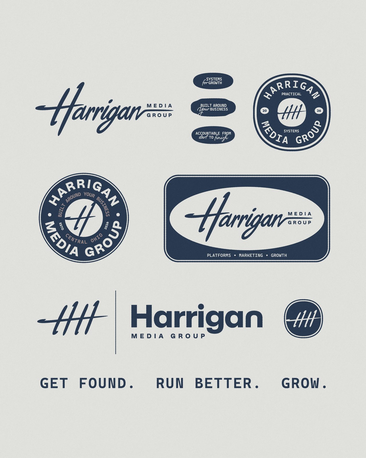
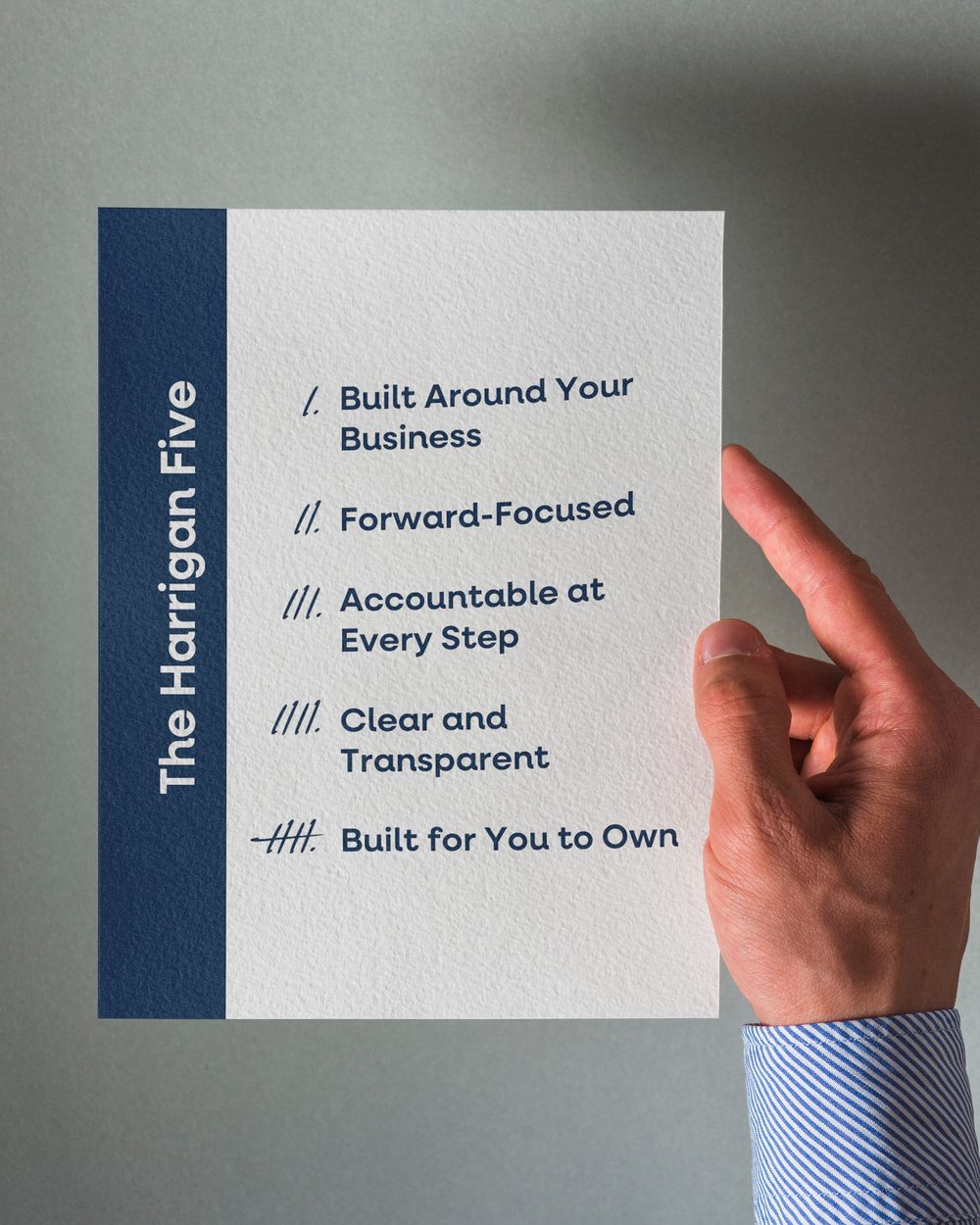
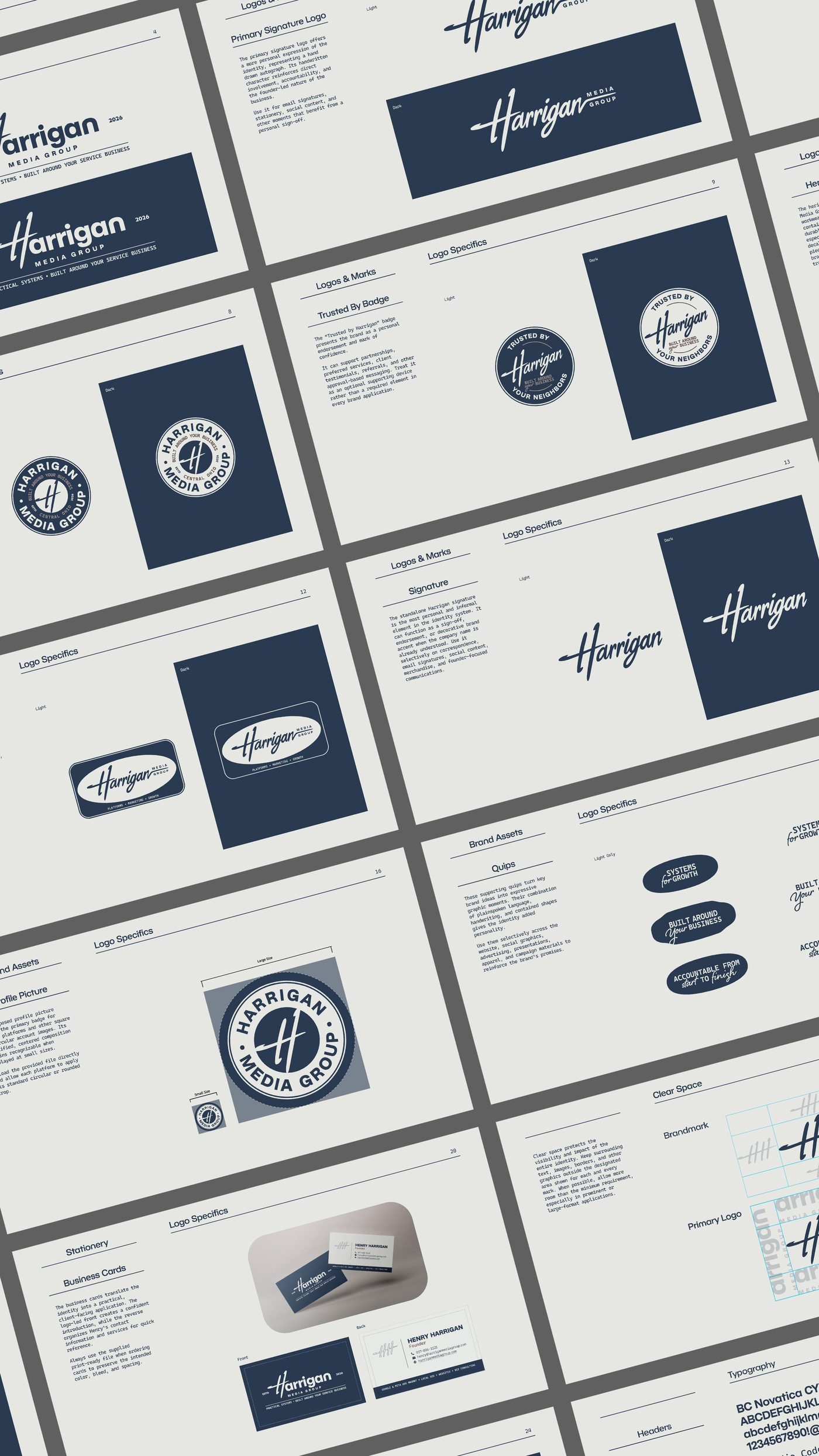
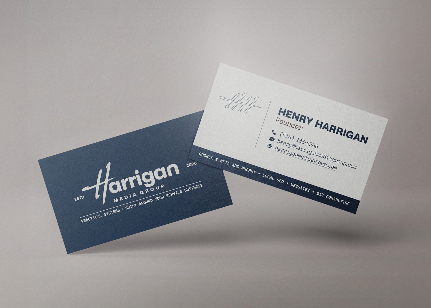
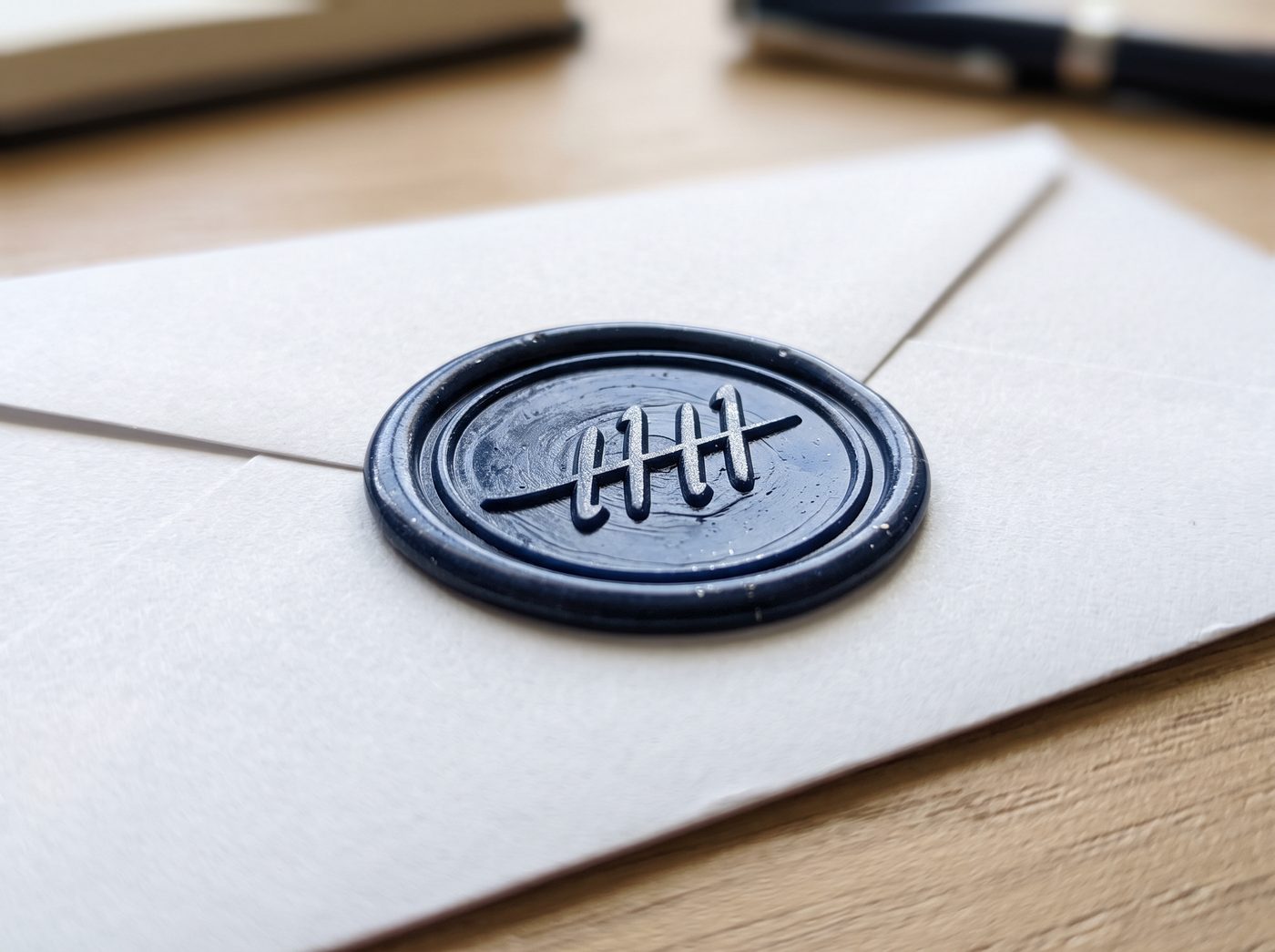
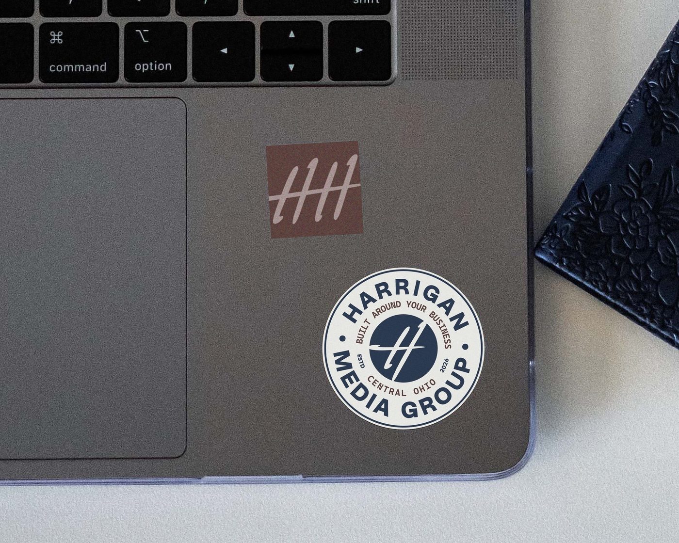
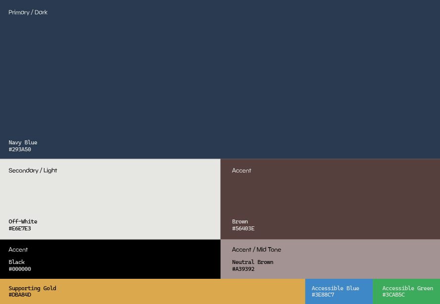
The solution. The identity development moved through hand sketches, typographic studies, flashboards, and two distinct logo directions. The selected direction combined the authority of a clean typographic system with the personal quality of Henry’s name and hand-drawn mark. The complete system balances personal accountability with professional capability for a business that serves multiple categories.
Got a name worth carrying forward?