
← All work

Case study · Branding

High Cotton

A hand-drawn gift shop logo, rebuilt into a brand that keeps the door open.

The brief

Developing a strong rebrand identity, expanding digital presence, launching a social media strategy, and targeting a younger audience, Studio Roo and partners created a cohesive visual and verbal identity that highlights High Cotton's humorous products, high quality, and artistic excellence.

The outcome is a witty, playful, and approachable brand identity system that charms audiences.

The identity

From sketch to system
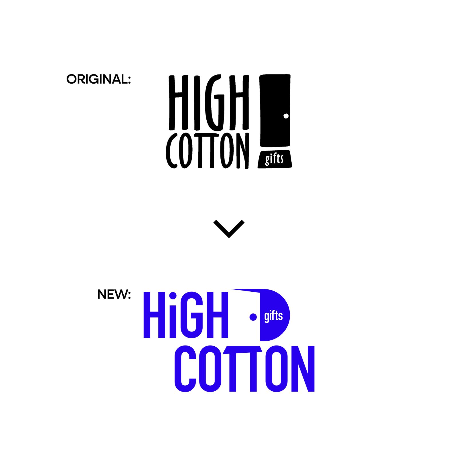
The original hand-drawn High Cotton logo above the rebuilt blue mark that replaced it
The original hand-drawn logo, and the rebuilt mark that replaced it. The door stayed.
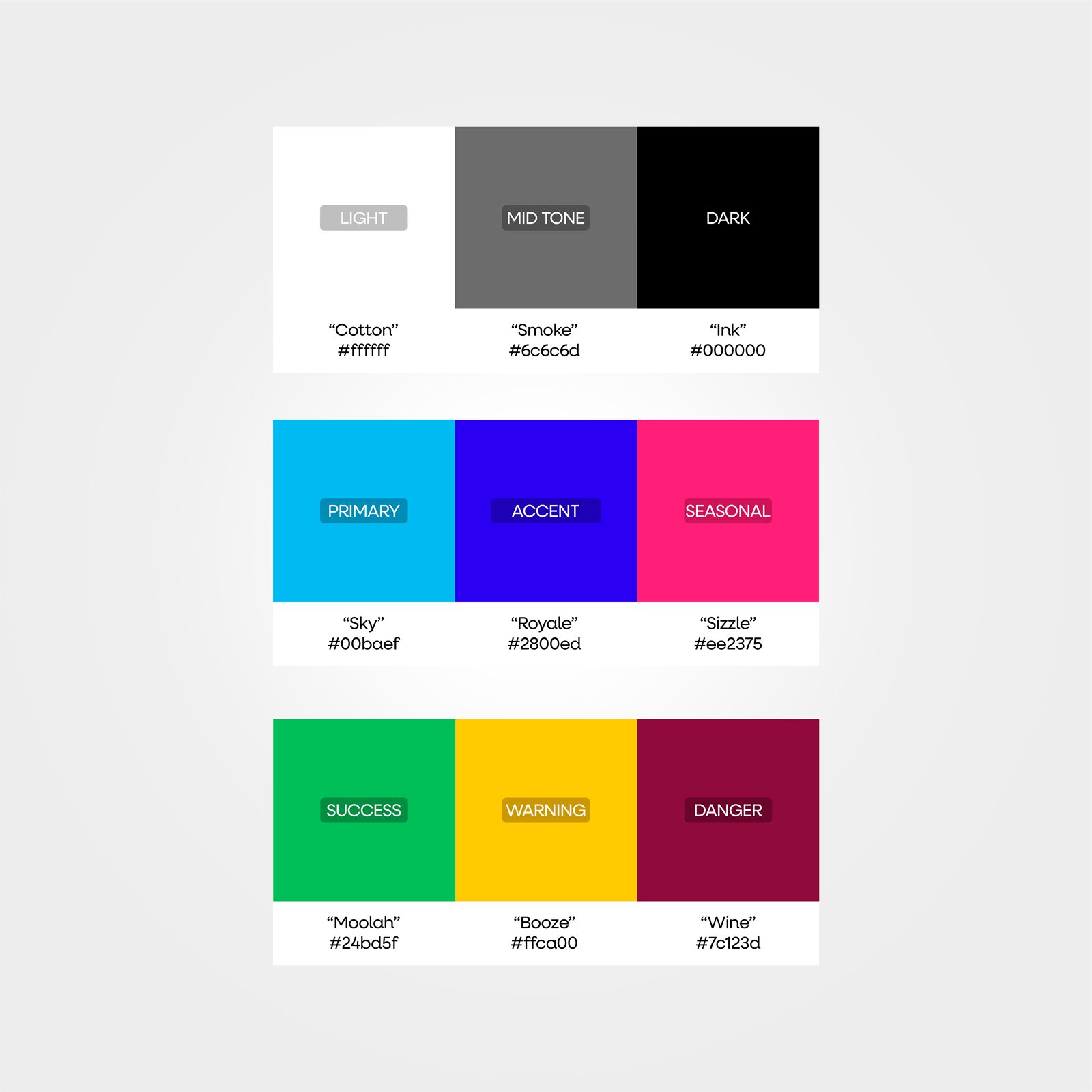
The High Cotton color palette key with nine named swatches including Sky, Royale, and Sizzle
Every color in the system has a name. Sky leads, Royale anchors, Sizzle handles the fun.
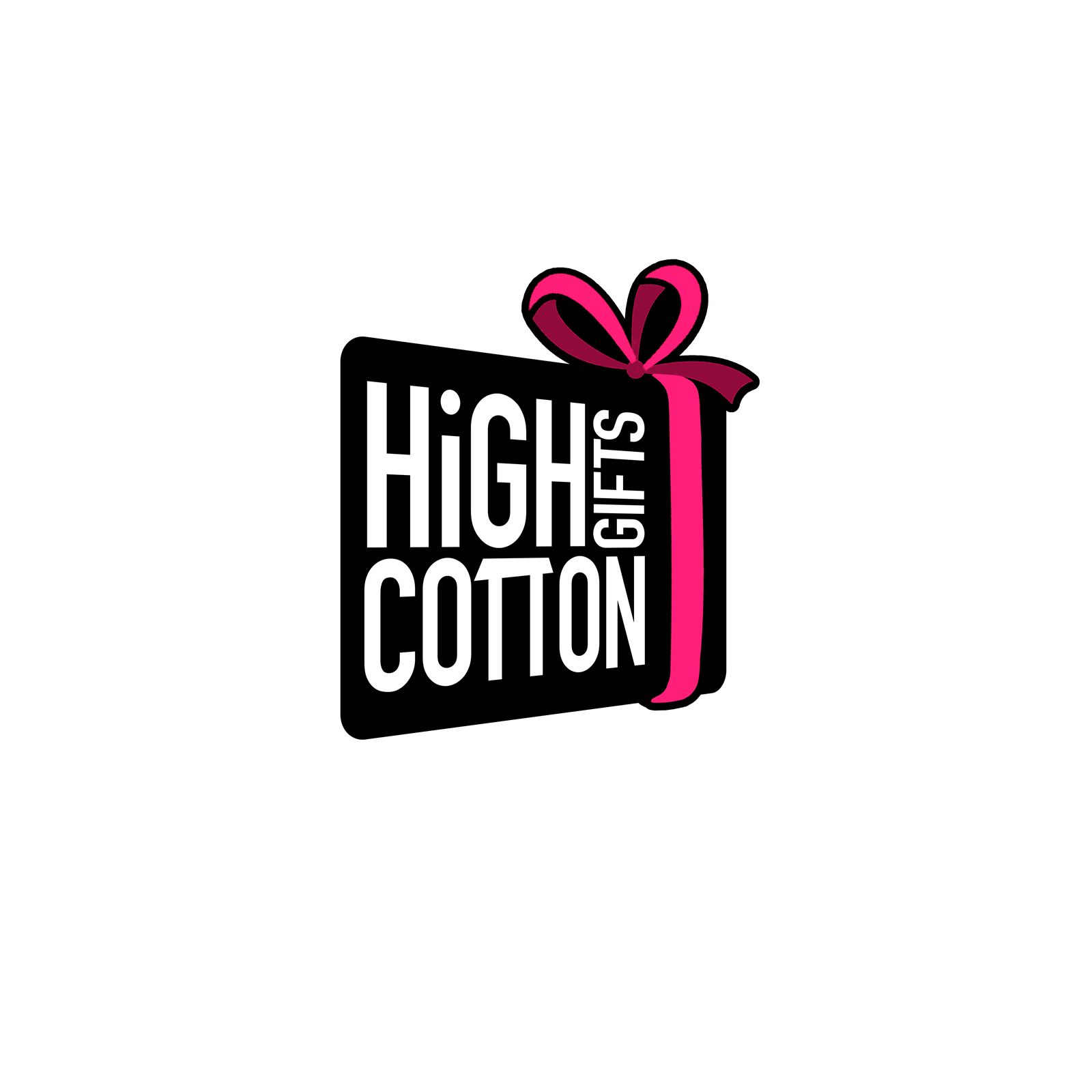
The seasonal High Cotton logo, the mark drawn as a black gift box wrapped with a pink ribbon and bow
The seasonal logo turns the mark into a wrapped gift, ribbon and all.

Gallery

Before the final mark

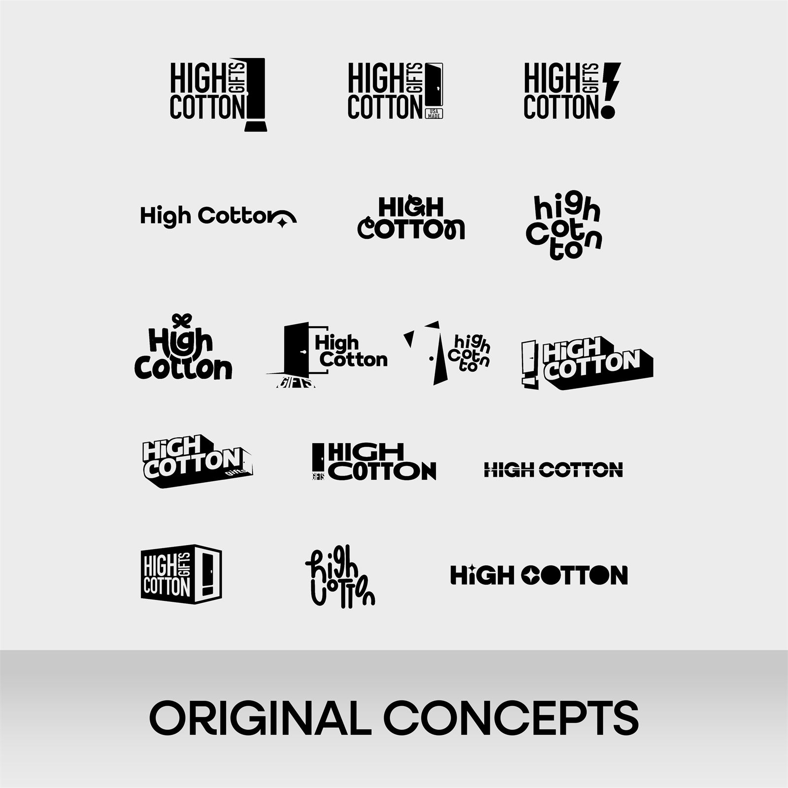
A sheet of black and white High Cotton logo concepts, from stacked wordmarks with door icons to loose hand-lettered scripts
The original concepts sheet, the exploration that led to the mark
The High Cotton wordmark repeated diagonally as a brand pattern over a sky-to-royal blue gradient
The wordmark, repeated into a brand pattern
Keep the door. Lose the wobble.
High Cotton brand identity

Got a logo you've outgrown?

Let's make something worth staring at.
Start a project See more work