
← All work

Case study · Branding

Rooted Youth

A youth ministry identity that grows from a single verse.

The brief

Creating a logo and brand identity for a local youth group.

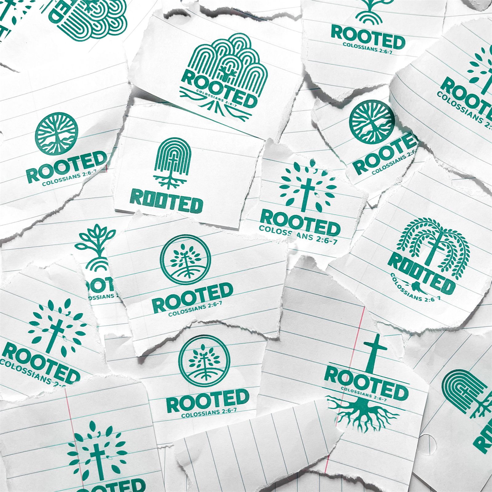
The system covers a tree badge, a wordmark, and an R monogram whose stem breaks into roots, all drawn in deep green and cream. A collage of process sketches shows the trees, roots, and crosses explored on the way there.

The identity

One tree, three marks
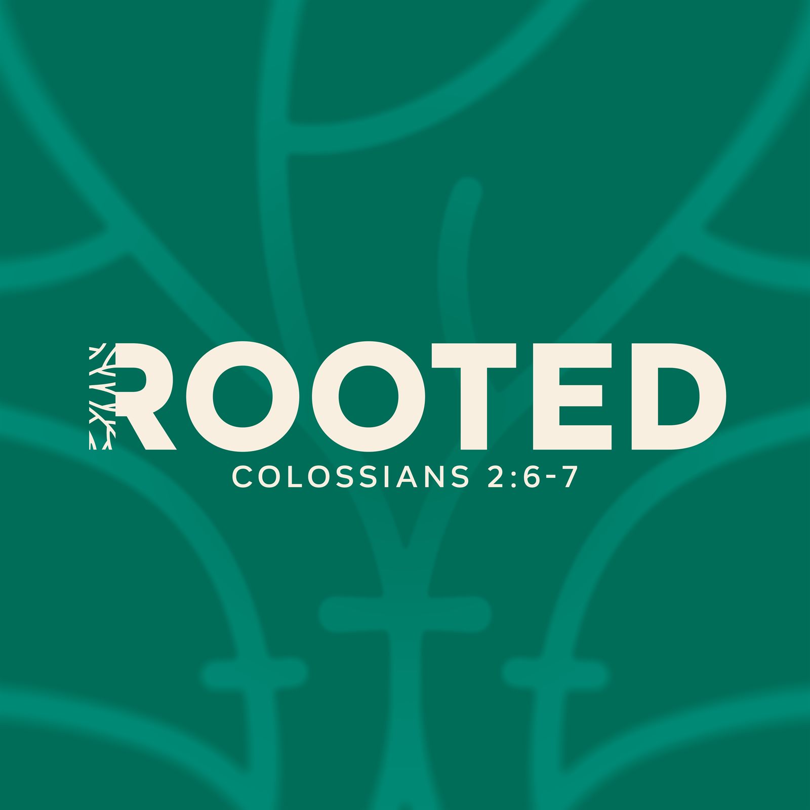
The Rooted wordmark with Colossians 2:6-7 beneath it, the stem of the R dissolving into roots, set over the badge linework enlarged as a background pattern
The wordmark, with the badge linework blown up behind it as a pattern
The Rooted monogram, a green capital R on cream whose left stem is drawn as branching roots
The R monogram, half letter and half root system, built for small sizes
A collage of torn notebook paper scraps, each printed with a different green Rooted logo sketch exploring trees, roots, and crosses
Process sketches
A cross in the branches, roots that hold. The whole brand is one tree.
Rooted, drawn from Colossians 2:6-7

Got a brand that needs roots?

Let's make something worth staring at.
Start a project See more work